Group presentation · Marketing Planning · Assignment 2

Process,
feedback,
lessons learnt.

A walk through the marking criteria, in order. The event, the initial ideas, the peer feedback received, the changes made (and the ones I respectfully rejected), and what I took away.

01 · Event description

What the event is, who it’s for, when and where.

Event

Cool Down London — a free three-day hybrid awareness pop-up commissioned by BeSMART (smart-thermostat brand) and produced by kelvin.

Benefits

Translates climate concern into specific smart-heating behaviour change. 3,500 attendees; 1,000 trial sign-ups; 250 corporate pledges; TRACE-verified net-positive carbon outcome.

Launch · location

15 – 17 October 2026, Old Truman Brewery, Brick Lane E1 6QR. Four weeks before COP31; UK heating season opens.

02 · Initial ideas

Where the poster started.

i1
Identity-first audience rows.

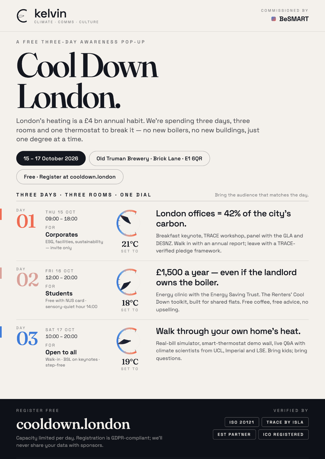
Three day-rows, each labelled with its audience (Corporates / Students / Open to all) and entry rule. Self-categorisation triggers in under a second — the reader knows which day is for them before reading anything else (Solomon, 2020).

i2
The dial does the work.

Big standalone numerals were dropped early — every temperature is rendered through a small KelvinMark dial with a leaf-needle and an explicit °C suffix, so no one reads “22” as “22 people”. Anchoring is concrete (Tversky & Kahneman, 1974) rather than vague (“turn it down”).

i3
Loss aversion as the lead.

£1,500 per year is the headline for the student day — concrete cost-of-inaction with sources cited inline to defuse the “marketing-claim” reflex (Kahneman, 2011).

i4
Credibility cues in the dark-bottom footer.

ISO 20121, TRACE-verified, EST partner — placed in the footer so they reassure without distracting from the call to action (Cialdini, 2009).

i5
Fraunces + Space Grotesk.

A modern serif (numerals, display) paired with a geometric sans (UI, body). Two voices, both literary — to carry data and warmth at the same time.

Initial Cool Down London A3 poster

Initial A3 portrait — the version sent out for peer review.

03 · Asking for feedback

The email I sent to my group.

FromDaniel Blümin
ToGroup (incl. Timofei, Anastasia)
Sentafter the two-week break
Reply byend of that week
SubjectA1 poster — feedback please

Sent to several group members; only Timofei and the tutor (Anastasia) responded in time.

Dear all,

I hope you are well and had a resting break 2 weeks ago. I know that this is another email, however it is critical that you do take the time to read this one, please.

I am sending attached to you my poster for my A1 event idea and since the second assignment is based upon your feedback shared with me, I wanted to kindly ask you to provide me with feedback to the poster by the end of this week. Please feel free to share your ideas with me as well and I will be glad to provide my feedback to yours as well.

Otherwise wishing everyone a pleasant week and good progress on all assignments.

Ps. the idea of the event is to convert generalised climate concern into specific smart-heating behaviour change, and to position BeSMART — my fictional client — as the trusted partner for that transition.

Best,
Daniel

04 · Feedback received & response

Two reviews. Two very different reads.

Feedback from
Timofei
Received Tue 19 May 2026
Overall design is clean, professional, eye-catching. The colour palette and type work together beautifully and the three-day differentiation gives a sense of realism. One minor recommendation: make the registration area at the bottom a little more prominent — it’s what you want the audience to do.
Accepted
Change made

Footer redesigned: cooldown.london wordmark scaled up ~1.4×, set in Fraunces display, anchored with a high-contrast “REGISTER FREE” kicker. Credibility badges pushed right so the CTA owns the left reading-eye.

Theory

Hierarchy of effects (Lavidge & Steiner, 1961) — for low-involvement decisions the call-to-action must dominate the lowest visual stop, not compete with it.

Feedback from
Anastasia (tutor)
Received Wed 20 May 2026
I really like the call to action. Statistics are good, but is your poster the best medium — or would they be better on a website? Statistics activate the rational part of our brain. You have such a powerful title — could you use imagery? Whilst still communicating the important numbers? Teamwork is for inspiration; you do not need to accept any feedback.
Partially accepted
Change made

Headline statistics were retained on the print poster — they are the rhetorical engine of the loss-aversion lead — but the deeper data (decision matrix, stakeholder model, programme detail, the full deliverables stack: immersive walk-through, real-bill simulator, smart-thermostat demo wall, student energy clinic with EST, B2B keynote stream and post-event toolkit) was moved to this companion website where readers can hover, click and verify. The poster now points at the URL; the URL carries the rational load.

Theory

Medium-message fit (McLuhan, 1964; Petty & Cacioppo, 1986, ELM): print operates on the peripheral route — affect, recognition, recall. Web supports the central route — argument, evidence, comparison. Splitting them honours each channel.

Feedback from
Anastasia — second point
Received Wed 20 May 2026
Could you use imagery? Images? Whilst still communicating the important numbers?
Respectfully rejected
Change made

A stock-photo of a radiator or a smiling student would dilute the dial, which is doing double duty as logo + data viz. Instead, the dial itself was elevated as the only “imagery” on the poster, and bigger photographic moments were reserved for the website hero on Day 3 (the immersive walk-through) where space and bandwidth allow.

Theory

Visual hierarchy and signal-to-noise (Tufte, 2001). Adding photographic imagery to a poster already carrying type, three dials, three statistics and a footer block risks crowding the lead. The brand mark is the imagery.

Feedback from
Timofei — implicit
Received Tue 19 May 2026
The thermostat visuals and temperature settings are such a nice way to tie the audience into the smart-heating theme.
Confirmed direction
Change made

Confirmed the decision to make the dial the only data-viz element. The dial was carried through into the landscape banner (16:9) and the 1080² social square so the system reads as one piece across formats.

Theory

Brand consistency / fluency (Schmitt, 2012): repeated exposure to the same mark across media compounds recognition faster than novel imagery per touchpoint.

05 · Final key message & poster

What shipped, and why.

Final Cool Down London A3 poster
Final key message

“Three days. Three rooms. One dial. Bring the day that fits your life.

Why this message: it does three jobs at once — frames the event format, signals audience self-selection, and removes the price barrier with the implicit “free, just turn up”. It works on print (poster, banner) and on screen (square social) without rewriting.

Why this poster: the £1,500 / £4 bn / 42% triad does the rhetorical work without slogans. The dial replaces every numeral that could be mis-read. The registration CTA was lifted in response to Timofei’s feedback. The deeper data was migrated to the website in response to Anastasia’s — but the statistics on the poster remained, because loss aversion is what gets the reader to the website in the first place.

06 · Reflection · how it felt

Receiving the feedback.

Timofei’s note was generous and surgical — exactly the kind of feedback that’s easy to act on because it identifies the problem (weak CTA) without prescribing the solution. Anastasia’s note was harder: it questioned my medium choice, which is closer to the spine of the work. The first instinct was defensive; the more useful instinct was to ask which of her points I could honour without abandoning the poster’s rhetorical strategy. That split — accept the CTA point, partially accept the medium point, respectfully reject the imagery point — turned out to be the most productive part of the assignment.

Delivering the assignment.

The single biggest lesson was that feedback is for inspiration, not compliance — I’m not obliged to accept any of it, but I am obliged to justify what I keep and what I change. Writing those justifications forced me to articulate theory I’d been applying tacitly (ELM, anchoring, hierarchy of effects). Practically, building this companion website was the cleanest way to honour the “rational data lives on web, affect lives on print” split — and it’s now the artefact I’d show a real client first.

07 · Lessons learnt & references

Three lessons.

  1. Medium first, message second. Print and web are different routes to persuasion (ELM); designing one before deciding which is doing the rational vs. affective work wastes both.
  2. Make the audience self-categorise before they read.The day-row structure (Corporates / Students / Open to all) earns attention in the first half-second; the body copy then has somewhere to land.
  3. Feedback is collaborative, not contractual. Each accept, reject or partial-accept needs to be justified in theory — that justification is the artefact tutors and clients actually grade.

References cited above.

  • Cialdini, R. B. (2009) Influence: Science and Practice. Pearson.
  • Kahneman, D. (2011) Thinking, Fast and Slow. Allen Lane.
  • Lavidge, R. J. & Steiner, G. A. (1961) ‘A model for predictive measurements of advertising effectiveness’, Journal of Marketing, 25(6).
  • McLuhan, M. (1964) Understanding Media: The Extensions of Man. McGraw-Hill.
  • Petty, R. E. & Cacioppo, J. T. (1986) Communication and Persuasion: The Elaboration Likelihood Model. Springer.
  • Schmitt, B. (2012) ‘The consumer psychology of brands’, Journal of Consumer Psychology, 22(1).
  • Solomon, M. R. (2020) Consumer Behaviour. 13th edn. Pearson.
  • Tversky, A. & Kahneman, D. (1974) ‘Judgment under uncertainty: heuristics and biases’, Science, 185.
  • Tufte, E. R. (2001) The Visual Display of Quantitative Information. 2nd edn. Graphics Press.

AI usage: Lovable AI assisted with copy iteration and SVG construction of the KelvinMark dial; all rhetorical, theoretical and design decisions are the author’s.